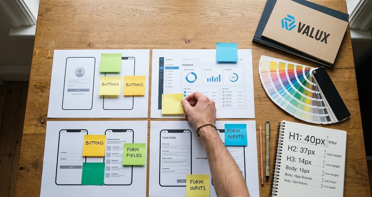
Every growing product hits the same wall. Buttons in five slightly different blues. Three date pickers built by three developers. A settings page that looks like it belongs to another app. Nobody decided this on purpose. It accumulated, one urgent feature at a time.
A design system is the fix, but plenty of them fail in a different way: a beautiful component library that nobody uses because it was built in isolation, is hard to adopt, or is out of date within a quarter. The system that works is the one people reach for by default because it makes their work faster.
In this guide, you'll learn:
- What a design system needs to include, and what can wait
- How to build it around real screens instead of an abstract ideal
- How to get designers and developers to adopt it and keep it alive
The same principles apply whether you have a team of three or thirty.
Table Of Contents
1. Start With an Audit, Not a Blank Canvas
Before designing anything new, collect what already exists. Screenshot every screen of your product and group similar elements: all the buttons, all the form fields, all the modals, all the colors and font sizes in use.
The result is usually humbling and always useful. You will see how many variants exist, which patterns are used most, and where the real inconsistencies hurt users. That inventory becomes your to-do list and your business case. It also stops you from designing an ideal system that ignores what the product actually needs.
Pro Tip: Show the audit to stakeholders. Twenty-three shades of gray on one slide makes the case for a design system faster than any argument.
2. Define the Foundations: Tokens First
Foundations are the small decisions everything else is built from. Store them as design tokens, named values that both design tools and code can read.
- Color. A limited palette with semantic roles such as primary, danger, surface, and text, not just raw hex values. Check contrast for accessibility from the start.
- Typography. A type scale with a few sizes and weights, and font choices that support both Latin and Arabic if your product is bilingual.
- Spacing. A consistent scale, for example multiples of four or eight pixels.
- Radius, shadow, and motion. A few named options instead of one-off values.
Tokens let you change a brand color or add dark mode in one place instead of hunting through hundreds of files.
3. Build Components From Real Needs
Resist the urge to build fifty components at once. Start with the ones your audit showed are used everywhere: buttons, inputs, selects, checkboxes, modals, alerts, tables, and navigation.
For each component, define its variants and states: default, hover, focus, disabled, loading, and error. Build in accessibility as you go, with keyboard support, visible focus, and proper labels. Retrofitting it later is far more expensive.
- 1Spot repetitionUsed in three or more places
- 2Design variantsStates and edge cases
- 3Build and testKeyboard and screen reader
- 4DocumentWhen to use it
- 5ReleaseVersioned and announced
A good rule: a pattern becomes a component when it appears in at least three places. Before that, keep it local and flexible.
4. Document Usage, Not Just Appearance
A gallery of components tells people what things look like. Documentation tells them when and how to use them, which is what prevents misuse.
For each component, write down:
- Purpose. What problem it solves and when to choose it over similar ones.
- Do and do not examples. Short visual comparisons are the fastest way to teach.
- Content guidelines. Label length, tone, and error message wording.
- Accessibility notes. Keyboard behavior and screen reader expectations.
- Code snippets. Copy-paste examples in your actual framework.
If a designer or developer cannot find an answer in under a minute, they will invent their own.
5. Connect Design and Code
The biggest cause of drift is a gap between the design file and the shipped product. Close it by making both sides pull from the same source.
- Keep tokens in a shared format that feeds both the design library and the code, so a change flows to both.
- Name components identically in design and code. If designers say "Toast" and developers say "Snackbar," confusion follows.
- Use a component workbench such as Storybook so developers and designers can see and test every state in isolation.
- Version the system and publish release notes so teams know what changed and when to upgrade.
| Layer | Owner | Example artifact |
|---|---|---|
| Tokens | Design and engineering | Shared color and spacing values |
| Components | Engineering | Tested, documented UI components |
| Patterns | Design | Layout and interaction guidance |
6. Drive Adoption and Governance
A design system is a product with internal customers. Treat adoption as the job.
- Make the easy path the right path. If using the system is faster than building from scratch, people will use it.
- Name an owner or a small core team. Shared responsibility with no owner means no maintenance.
- Create a simple contribution process. Teams must be able to request or propose components, with clear review criteria and quick responses.
- Measure use. Track how many screens use system components and how many one-off overrides exist.
- Migrate gradually. Replace old patterns as screens are touched rather than in a risky big-bang rewrite.
Expect the first version to be imperfect. A modest system that is used and maintained beats a perfect one that is ignored.
7. Frequently Asked Questions
When is a company ready for a design system?
When more than one designer or developer is building screens and inconsistencies start slowing delivery or confusing users. A small product can start with just tokens and a handful of core components, then grow as needs appear.
Should we build our own design system or use an existing one?
Starting from an established open-source foundation can save time, especially for accessibility and complex components. Many teams then layer their own tokens and a few custom components on top so the product keeps its own identity.
What are design tokens?
Design tokens are named values for foundational decisions such as colors, font sizes, spacing, and radius. Because both design tools and code can read them, changing a token updates every place it is used.
How do we keep a design system from going stale?
Give it a named owner or small core team, a simple contribution process, versioned releases with notes, and metrics on adoption. Update it as part of normal product work rather than as a separate side project.
Conclusion
A design system succeeds when it grows out of real product needs: audit what exists, set tokens as the foundation, build the most repeated components first, document how to use them, link design and code, and treat adoption like a product launch. The payoff is faster delivery, fewer inconsistencies, and interfaces that feel like one product.
Start small, ship it, and let usage tell you what to build next.
💬 What is the most inconsistent element in your product's interface today?



Comments